2023年6月29日—7月7日,缙云县委人才科技办面向社会公开征集“国际人才科创”形象标识(LOGO)。经评委小组初选,综合考虑作品的设计寓意、构思新颖性、艺术表现力等,最终选出4个作品进入复选投票,投票截至7月16日,快来为您喜爱的作品投上宝贵的一票吧!
据了解,缙云县正在积极开展丽水市“十子连珠”之国际人才科创园建设,此次logo征集主要是为了突出展现国际人才科创园的国际范、科创感、服务暖心等属性特点。
下面让我们先来看看有哪些作品入围吧!
(作品序号不代表排名)
NO.1
一号作品
NUMBER ONE

创意说明:
Description:
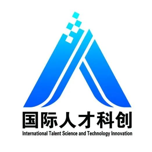
标识以地球造型为主,融合了抽象的六个人的造型为主,体现国际人才科创的品牌特征,地球造型体现国际化的发展视野,抽象的人形环绕地球,体现缙云提供国际性、科技感、全方位人才服务的愿景,信息方格元素体现科技和未来,标识醒目简洁,时尚大气,便于推广和应用!
The logo features a representation of the Earth as the main element, incorporating abstract forms of six individuals. It embodies the brand characteristics of international talent and innovation. The Earth symbolizes a global development perspective, while the abstract human figures surrounding it represent Jinyun's vision of providing international, technology-driven, and comprehensive talent services. The information grid elements represent technology and the future. The logo is eye-catching, concise, stylish, and easy to promote and apply.
NO.2
二号作品
NUMBER TWO


创意说明:
Description
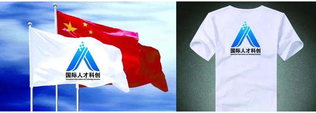
由字母“J”(缙云县拼音首字母)经变形结合综合性元素进行创意延伸,悦动飞扬的线条笔触相互融汇,同时融入科创元素,文字“人”(突出人才蕴含),整体聚拢中心趋向美好未来,以蔚蓝色渲染渐变,唯美表现出了健康向上,清新和谐,具有活力激情,充满无限生命力和创造力,生机勃勃,睿翼进取,蓬勃发展,努力发展人才事业,一派欣欣向荣景象的国际人才科创品牌美好氛围。
The logo is derived from the letter "J" (the initial of Jinyun County in Pinyin) and creatively combines it with comprehensive elements. The flowing and dynamic strokes of the lines merge together, incorporating elements of innovation and technology. The character “人” highlights the essence of talent, while the overall design converges towards a bright future.
The logo is rendered in a gradient of azure blue, portraying a beautiful representation of health, freshness, harmony, vitality, passion, and boundless creativity. It signifies a thriving and enterprising atmosphere, symbolizing the vigorous development of the talent industry and creating a positive and prosperous international brand for talent-driven innovation.
NO.3
三号作品
NUMBER THREE

创意说明:
Description
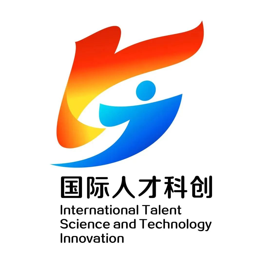
标志名称:《腾飞》
以汉字“人"和“飞鸟”为设计结构,色彩醒目亮丽。
整体形态简约,构图精致,流畅清晰的线条充满了动感与活力;人形大踏步跨越,飞鸟腾飞之势,饱含着前进的动力和气势,体现出人才科创充满生机不断进步的内涵;
整体造型质朴简约、静动相生、线条流畅,富有动感,图案简洁大气,易于识别和记忆!
Logo Name: “Soar”
The design structure is based on the Chinese characters “人” and “飞鸟”, with eye-catching and vibrant colors.
The overall form is minimalistic, with exquisite composition and smooth, clear lines that exude a sense of dynamism and vitality. The figure of a person taking large strides and the soaring bird symbolize the driving force and momentum of progress in talent-driven innovation.
The overall shape is simple and unadorned, with a harmonious blend of stillness and movement. The flowing lines convey a sense of dynamism, while the design itself is concise, bold, and easy to recognize and remember.
NO.4
四号作品
NUMBER ONE

创意说明:
Description:
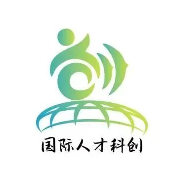
1.“创”字:作为LOGO的核心元素, “创”字代表着创新、创造和科技感。它体现了缙云县“国际人才科创园”的科技创新和高端制造的特点,也表达了对未来产业发展的追求。
2.人才:人才形象代表着科创园的核心价值——人才服务属性。它象征着科技领域的专业人才和国际化人才的聚集。通过人才形象的呈现,传递出缙云县欢迎国际人才的开放态度。
3.飞鸟:飞鸟是LOGO中的另一个重要元素,它代表着创新和自由。飞鸟的存在表示人才在科创园中可以自由展翅飞翔,实现想象力和创造力的自由发挥。
4.地球:地球是全球华人纽带的象征,同时也体现了缙云县作为国际人才科创园的国际性质。地球的存在表明科创园与全球其他科技中心和创新园区之间存在着紧密的联系和合作。
5.对于颜色的选择,采用了绿色和青绿色的渐变。绿色代表生态环保和可持续发展,符合缙云县在氢能及储能等未来产业建设目标上的努力。青绿色则给人一种科技感和活力,与科创园的创新精神相契合。
1. The character “创”: As the core element of the logo, the character “创” represents innovation, creation, and a sense of technology. It embodies the characteristics of technological innovation and high-end manufacturing in Jinyun County's “International Talent and Innovation Park”, as well as the pursuit of future industrial development.
2. Talent: The depiction of human figures represents the core value of the innovation park—talent service. It symbolizes the gathering of professionals in the field of technology and international talents. Through the portrayal of human figures, it conveys Jinyun County's open attitude towards welcoming international talents.
3. Flying Bird: The flying bird is another important element in the logo, representing innovation and freedom. The presence of the bird signifies that talents within the innovation park can freely spread their wings and soar, unleashing their imagination and creativity.
4. Earth: The Earth symbolizes the bond among the global Chinese community and also reflects the international nature of Jinyun County as an international talent and innovation park. The presence of the Earth indicates the close connection and cooperation between the innovation park and other global technology centers and innovation zones.
5. For the color selection, a gradient of green and cyan has been used. Green represents ecological conservation and sustainable development, aligning with Jinyun County's efforts in future industries such as hydrogen energy and energy storage. Cyan gives a sense of technology and vitality, resonating with the innovation spirit of the innovation park.
征集官方网站:https://www.1zj.com/ 官方微信公众号:征集网
征集发布电话:159-677-55955(微信同号)
上一篇:东莞台湾名品博览会发布全新logo
下一篇:伊春市“无废城市”logo征集投票


 微信扫一扫◆